By Gary simon - Jan 20, 2018
Last year, I released a Bootstrap 4 Course, but it was in alpha back then. Literally 2 days ago, (January 18), Bootstrap 4 released to its full 4.0.0 version.
With that said, this provides me with a great opportunity to create a brand new crash course to help everyone get up to speed with the first full version of Bootstrap 4.
This course will be in no way comprehensive, rather, it will help you get up and running as quickly as possible while having the confidence to read and understand the documentation. I will show you how to integrate it through two different methods, and then start building a layout while referencing the documentation.
Let's get started!
Be sure to Subscribe to the Official Coursetro Youtube Channel for more videos.
For our project, we're not going to use this method, because while it is quick, it doesn't afford you the ability to use Sass. If you just need Bootstrap for the purposes of quickly prototyping, it makes sense to use the CDN method.
You don't have to follow this part, because again, we're not going to use it for our project, but just to show you how to integrate it via the CDN method, you would create an index.html file with the following:
<!doctype html>
<html lang="en">
  <head>
    <meta charset="utf-8">
    <meta name="viewport" content="width=device-width, initial-scale=1, shrink-to-fit=no">

    <!-- Bootstrap CSS -->
    <link rel="stylesheet" href="https://maxcdn.bootstrapcdn.com/bootstrap/4.0.0/css/bootstrap.min.css" integrity="sha384-Gn5384xqQ1aoWXA+058RXPxPg6fy4IWvTNh0E263XmFcJlSAwiGgFAW/dAiS6JXm" crossorigin="anonymous">

    <title>Bootstrap 4 Starter Template</title>
  </head>
  <body>
    <h1>Hello</h1>

    <!-- Optional JavaScript -->
    <!-- jQuery first, then Popper.js, then Bootstrap JS -->
    <script src="https://code.jquery.com/jquery-3.2.1.slim.min.js" integrity="sha384-KJ3o2DKtIkvYIK3UENzmM7KCkRr/rE9/Qpg6aAZGJwFDMVNA/GpGFF93hXpG5KkN" crossorigin="anonymous"></script>
    <script src="https://cdnjs.cloudflare.com/ajax/libs/popper.js/1.12.9/umd/popper.min.js" integrity="sha384-ApNbgh9B+Y1QKtv3Rn7W3mgPxhU9K/ScQsAP7hUibX39j7fakFPskvXusvfa0b4Q" crossorigin="anonymous"></script>
    <script src="https://maxcdn.bootstrapcdn.com/bootstrap/4.0.0/js/bootstrap.min.js" integrity="sha384-JZR6Spejh4U02d8jOt6vLEHfe/JQGiRRSQQxSfFWpi1MquVdAyjUar5+76PVCmYl" crossorigin="anonymous"></script>
  </body>
</html>
This is straight from the Bootstrap 4 Getting Started page.
With this template, you can get started using Bootstrap right away. The benefit is it's simple to get started, but the downside is that you lack the customization that Sass offers.
We're going to start our project right here at this stage. This will require using Node.js and its package manager to install bootstrap itself, along with a few other packages. This will give us access to Sass, live browser reloading, etc..
First, make sure you have Nodejs installed by opening up your console or command line:
> node -vIf this goes unrecognized, visit Nodejs.org and click downloads. Download the appropriate installer based on your OS and follow through the installation process with the default options.
Once complete, reload your console or command line and you will have access to thoe node command.
Let's create a folder for our project and hop into it:
> mkdir bs4 && cd bs4Next, we're going to run npm init to create a package.json file, which simply stores our dependencies.
> npm init -y(Note: The -y flag simply allows us to skip answering the various prompts and instead provides them with the defaults)
Next, we're going to use npm once again to install several different packages as development dependencies:
> npm install gulp browser-sync gulp-sass --save-devThen, we're going to use npm one final time to install several packages as regular project dependencies:
> npm install bootstrap jquery popper.js --saveNext, open up your code editor. If you're using Visual Studio Code, simply type code . in the command line within the project folder and it will launch the app.
Inside of here, let's create the following folders:
/src
    /assets
    /css
    /js
    /scss
Inside of /src, also create the 4 folders proceeding it as shown above.
Next, create an index.html file inside of /src/ with the following contents:
<!DOCTYPE html>
<html class="no-js" lang="en">
    <head>
        <title>Bootstrap 4 Layout</title>
        <meta http-equiv="x-ua-compatible" content="ie=edge">
	    <meta name="viewport" content="width=device-width, initial-scale=1.0" />

        <link rel="stylesheet" href="https://fonts.googleapis.com/css?family=Raleway:400,800">
        <link rel='stylesheet' href="https://maxcdn.bootstrapcdn.com/font-awesome/4.7.0/css/font-awesome.min.css">
        <link rel="stylesheet" href="/css/bootstrap.css">
        <link rel="stylesheet" href="/css/styles.css">
    </head>

    <body>
        <script src="/js/jquery.min.js"></script>
        <script src="/js/popper.min.js"></script>
        <script src="/js/bootstrap.min.js"></script>
    </body>
</html>
So, we have a few things happening here. I'm importing the Raleway font along with FontAwesome for icons. Then I'm referencing bootstrap.css itself and a styles.css file. These don't exist yet, but they will shortly.
Then, finally, we have our javascript files. They don't exist yet either. Hang tight though.
Let's also create a styles.scss file inside of the /src/scss/ folder. We're going to put in a quick variable and a ruleset to ensure that Sass compiling is working in a bit:
$bg-color: red;

body {
    background: $bg-color;
}
In the root folder (the project folder), create a file called gulpfile.js and paste the following contents:
var gulp        = require('gulp');
var browserSync = require('browser-sync').create();
var sass        = require('gulp-sass');

// Compile sass into CSS & auto-inject into browsers
gulp.task('sass', function() {
    return gulp.src(['node_modules/bootstrap/scss/bootstrap.scss', 'src/scss/*.scss'])
        .pipe(sass())
        .pipe(gulp.dest("src/css"))
        .pipe(browserSync.stream());
});

// Move the javascript files into our /src/js folder
gulp.task('js', function() {
    return gulp.src(['node_modules/bootstrap/dist/js/bootstrap.min.js', 'node_modules/jquery/dist/jquery.min.js', 'node_modules/popper.js/dist/umd/popper.min.js'])
        .pipe(gulp.dest("src/js"))
        .pipe(browserSync.stream());
});

// Static Server + watching scss/html files
gulp.task('serve', ['sass'], function() {

    browserSync.init({
        server: "./src"
    });

    gulp.watch(['node_modules/bootstrap/scss/bootstrap.scss', 'src/scss/*.scss'], ['sass']);
    gulp.watch("src/*.html").on('change', browserSync.reload);
});

gulp.task('default', ['js','serve']);
I will describe what's happening here based on the tasks defined above:
Whew, that's a lot of work, right? Well, fortunately, we're done with the setup.
Let's run gulp in the command line:
> gulpWith any luck, http://localhost:3000 will load up in the browser and your background will be bright stinking red! This means everything should be good to go.
The starting point of your Bootstrap 4 project is almost always going to revolve around the grid container. The .container class allows you to horizontally center your layout. Alternatively, for a fluid layout (100% width), you can use .container-fluid.
So, let's define a grid container as the very first element in our layout:
    <body>
        <div class="container">
            test
        </div>

        ...3 script tags omitted
    </body>
Also, remove everything from your styles.scss as we don't want a red background.
If you look at your browser and get out the inspector (CTRL-SHIFT-i on Chrome), click on the element selector icon, and hover over the "test" text, you will see the outline of the container. This is a responsive container, so, you can shrink the width of your browser and observe how it reacts.
After defining a container, the next most likely section section of your layout will probably be a navigation of some sort. In Bootstrap, this is referred to as a navbar.
Note: Check out the Navbar Documentation. The Documentation for every Bootstrap 4 element is quite comprehensive. It provides you with examples along with the associated code.
Most header navigations include a company logo, usually left-aligned. We will also include a navigation that's right-aligned.
Inside of our .container element, let's add the following:
<div class="container">
    <nav class="navbar navbar-expand-lg navbar-dark bg-primary">
        <a class="navbar-brand" href="#">CompanyName</a>

        <div class="collapse navbar-collapse" id="navbarSupportedContent">
            <ul class="navbar-nav ml-auto">
                <li class="nav-item">
                    <a class="nav-link" href="#">Home</a>
                </li>
                <li class="nav-item">
                    <a class="nav-link" href="#">About</a>
                </li>
                <li class="nav-item">
                    <a class="nav-link" href="#">Products</a>
                </li>
                <li class="nav-item">
                    <a class="nav-link" href="#">Contact</a>
                </li>
            </ul>
        </div>
    </nav>
</div>
The result in the browser at this point should be consistent with the following:
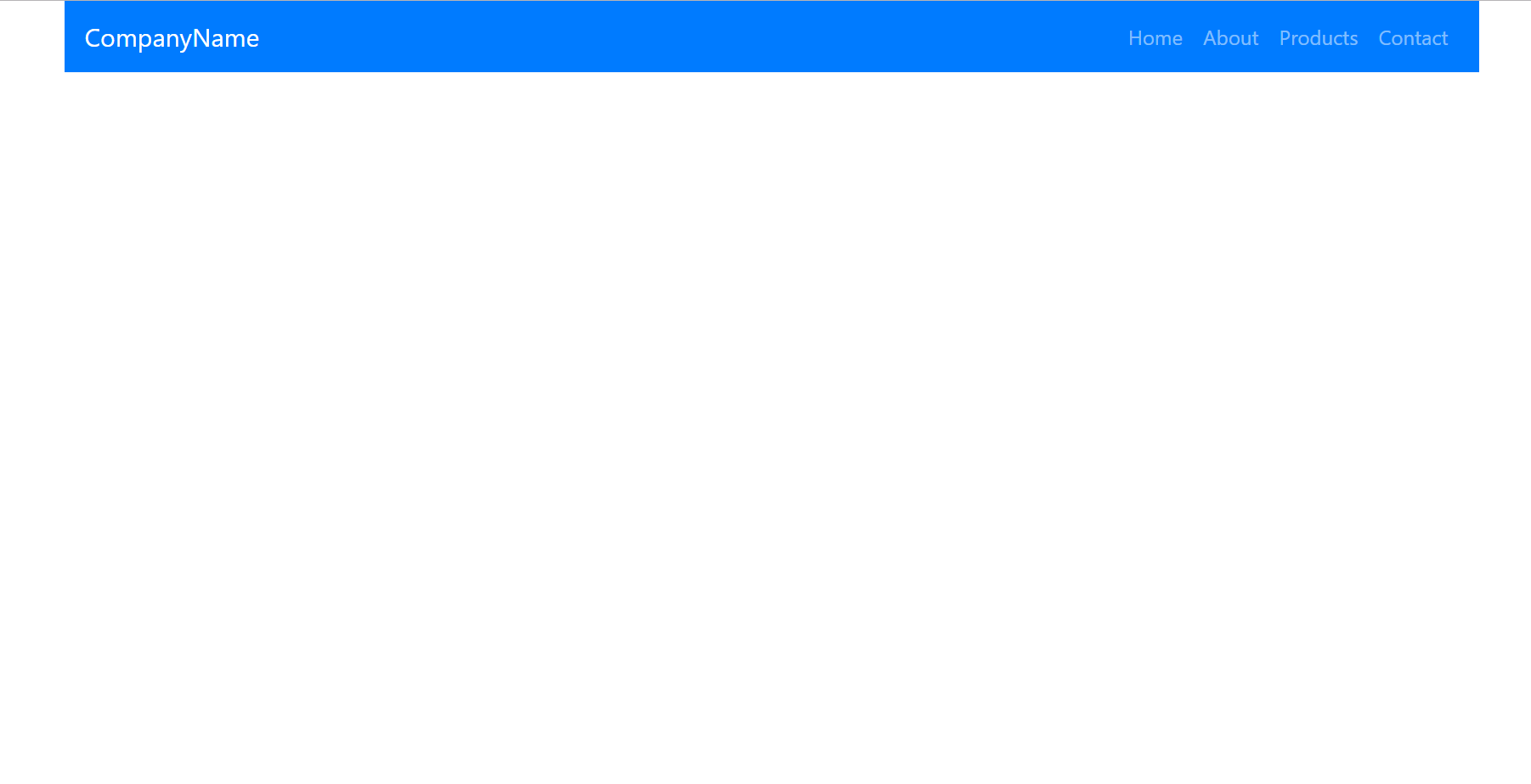
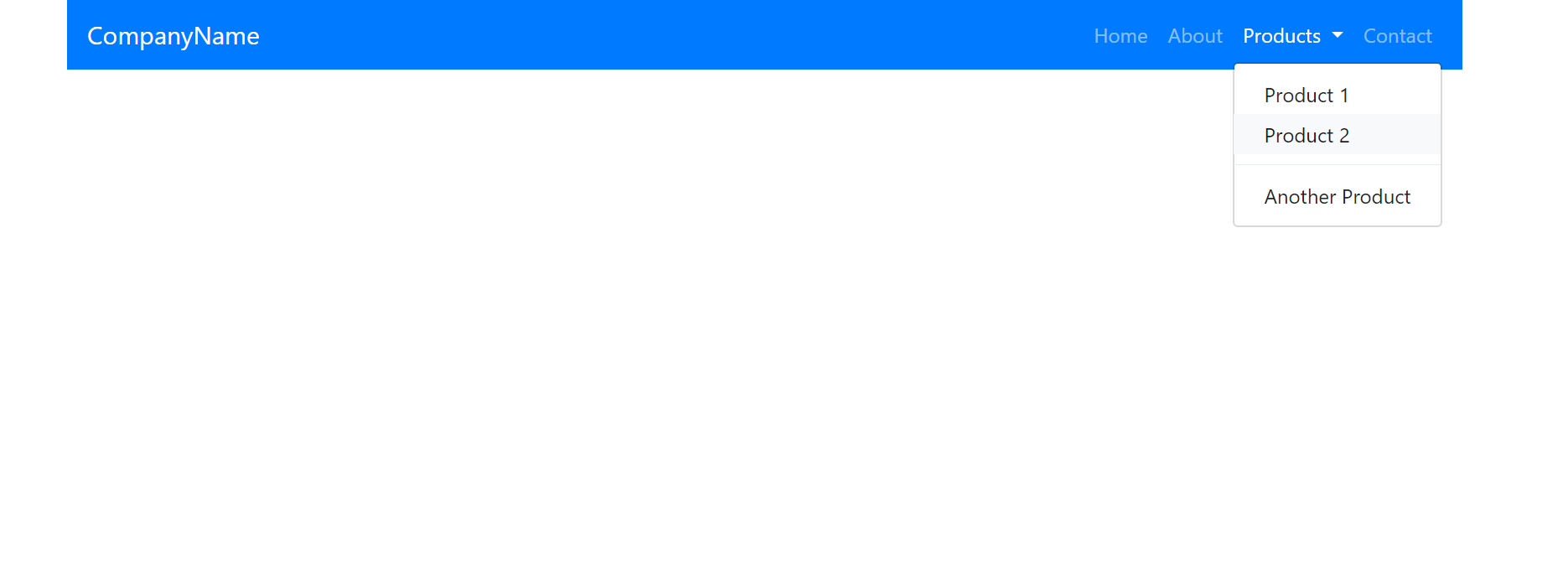
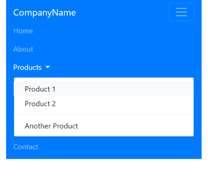
As you can see, a simple header with a navigation. For the Products list item, let's alter it so that it becomes a dropdown menu:
<li class="nav-item dropdown">
    <a class="nav-link dropdown-toggle" href="#" id="navbarDropdown" data-toggle="dropdown">
        Products
    </a>
    <div class="dropdown-menu">
        <a class="dropdown-item" href="#">Product 1</a>
        <a class="dropdown-item" href="#">Product 2</a>
        <div class="dropdown-divider"></div>
        <a class="dropdown-item" href="#">Another Product</a>
    </div>
</li>
The result should now look like this:
Easy! Right now, our navigation lacks a button on mobile devices. So, we have to add the HTML necessary for that to work.
Add the following markup between the brand and navbarSupportedContent div:
<a class="navbar-brand" href="#">CompanyName</a>

<!--Add here -->
<button class="navbar-toggler" type="button" data-toggle="collapse" data-target="#navbarSupportedContent">
    <span class="navbar-toggler-icon"></span>
</button>
<!--Add here -->

<div class="collapse navbar-collapse" id="navbarSupportedContent">
After saving, drag your browser into a mobile viewport and click on the toggle button. The result should be similar to this:
As you can see, it's incredibly simple to build out a robust, responsive navigation with Bootstrap 4.
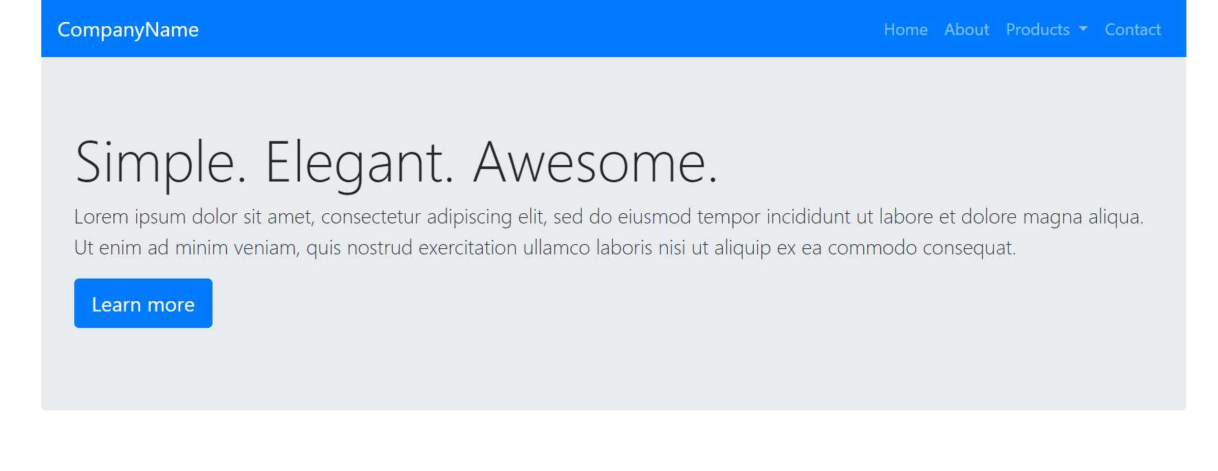
A next common element for many layouts and landing pages is a hero section. In Bootstrap 4, this is referred to as a Jumbotron.
Underneath our <nav> .. </nav> container, add the following HTML:
...
</nav>

<!-- Add here -->

<div class="jumbotron">
    <h1 class="display-4">Simple. Elegant. Awesome.</h1>
    <p class="lead">Lorem ipsum dolor sit amet, consectetur adipiscing elit, sed do eiusmod tempor incididunt ut labore et dolore magna aliqua. Ut enim ad minim veniam, quis nostrud exercitation ullamco laboris nisi ut aliquip ex ea commodo consequat. </p>

    <p class="lead">
        <a class="btn btn-primary btn-lg" href="#" role="button">Learn more</a>
    </p>
</div>
Most of this HTML was taken from the Jumbotron documentation, but I simply modified and removed some of the elements to suit my needs. For the most part, you can do this for any other needed Bootstrap 4 element, as their documentation provides you with plenty of examples.
The result in the browser should now look like this:
Is it cookie cuter so far? Yes, does it have to be? No, and you will see how we can make customizations later on.
Perhaps the most important aspect to understand when it concerns BS 4 is the grid system. It's based on Flexbox, and if you're wondering, no -- the grid system in BS 4 is not based on the new CSS grid, unfortunately.
Bootstrap 4 was developed for years and they were already dedicated to Flexbox. At this point, Flexbox is a safer bet, being that the CSS grid is supported by 76% of browsers and Flexbox is at almost 100%.
The Grid Documentation is very detailed with a ton of options and examples. Be sure to refer to this page whenever you have certain needs.
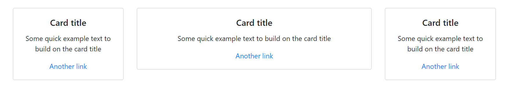
For our purposes, initially, we're going to define a section in our layout that will have 3 equal width columns. Inside of these columns, we will have just some features associated with our fake company. We're going to use Bootstrap 4 Cards for the inner content inside each of these columns:
<div class="row">
    <div class="col">
        <div class="card">
            <div class="card-body text-center">
                <h5 class="card-title">Card title</h5>
                <p class="card-text">Some quick example text to build on the card title</p>
                <a href="#" class="card-link">Another link</a>
            </div>
        </div>
    </div>
</div>
This is the result in the browser so far:
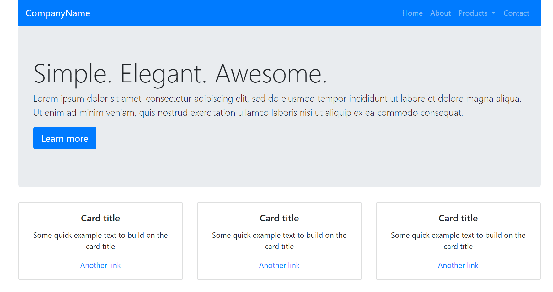
These are all equal width columns, which is achieved by simply specifying a class of .col onto each column.
If you wanted one of these 3 rows to have a larger width, you could specify .col-# (# being one through 12):
<div class="row">
    <div class="col">
        ...
    </div>
    <div class="col-6">
        ...
    </div>
    <div class="col">
        ...
</div>
And the grid will automatically adjust the width of the remaining columns like so:
We don't want that, though. So you can remove -6 from the middle column.
Right now, if you adjust the browser to a mobile viewport, you will see that our grid is not responsive; they remain in 3 columns.
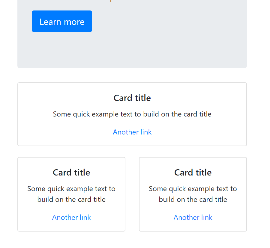
Let's say for instance that we want our very first card in the first column to span 100% width of the viewport (assume all 12 columns) on small viewports only:
<div class="row">
    <div class="col-sm-12 col-md-4">
        <div class="card">
We first specify .col-sm-12, which means that on small viewports, this column will take up all 12 columns.
Then, we specify .col-md-4 which means that on medium viewports and larger, it will assume 4 columns:
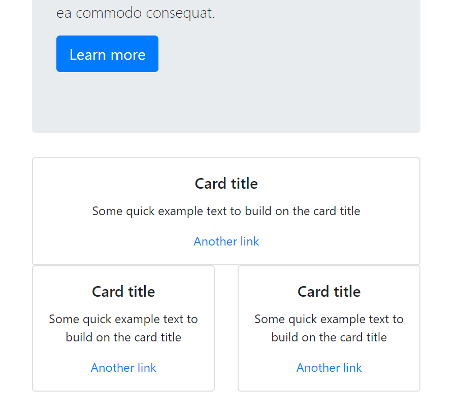
There is, of course, a lot more to learn about the Bootstrap 4 grid system, but that is the general gist. You use a variety of grid classes to define the amount of rows a column should assume on a given viewport.
Notice in our example image above, there's no margin between our card elements? If you ever need to add either margin (the space outside of an element) or padding (the space inside of an element) you can use the margin and padding helper classes.
It works like this:
So, in our example, it looks like we need to use margin and bottom to push away the cards beneath it.
On the first card container, add mb-4:
<div class="card mb-4">It's now fixed:
That's how you can easily handle both margin and padding in Bootstrap 4.
Let's gain some more experience using different Bootstrap 4 components.
Let's add a section beneath our 3 columns, at the end of the closing </div> for the row class which will have 2 columns. The first column will assume most of the columns (8) and the right column will be for a vertical navigation in the section after this.
<div class="row mt-sm-4 mt-md-0">
    <div class="col-sm-12 col-md-8">
        <h3>An important heading</h3>
        <p class="lead">A sort of important subheading can go here, which is larger and gray.</p>

        <p>Lorem ipsum dolor sit amet, consectetur adipiscing elit, sed do eiusmod tempor incididunt ut labore et dolore magna aliqua. Ut enim ad minim veniam, quis nostrud exercitation ullamco laboris nisi ut aliquip ex ea commodo consequat. Duis aute irure dolor in reprehenderit in voluptate velit esse cillum dolore eu fugiat nulla pariatur.</p>
        <p>Ut enim ad minim veniam, quis nostrud exercitation ullamco laboris nisi ut aliquip ex ea commodo consequat. Duis aute irure dolor in reprehenderit in voluptate velit esse cillum dolore eu fugiat nulla pariatur.</p>
    </div>

    <div class="col-sm-12 col-md-4">
        ..vertical navigation shortly..
    </div>
</div>
Bootstrap 4 has a Typography section in their Documentation that will provide you with all of the type-based helper classes. It's fairly straightforward. We're using .lead to place emphasis on a subheading underneath our h3 element.
There is also a Text utilities section in their Documentation that provides you with text alignment options, transform, italics and font weights.
On small viewports, let's say that we want our type to be centered instead of the default behavior, which is left aligned.
We would add the following class:
<div class="col-sm-12 col-md-8 text-sm-center text-md-left">
This will result in the text contained within the div to be centered on small viewports and left aligned on medium and larger.
We'll add one more element before we get to the business of customization. In our right column that we just added, let's add a Vertical Navigation:
<div class="col-sm-12 col-md-4">
<h3 class="mb-4">Secondary Menu</h3>
<ul class="nav flex-column nav-pills">
<li class="nav-item">
<a class="nav-link active" href="#">Active</a>
</li>
<li class="nav-item">
<a class="nav-link" href="#">Link</a>
</li>
<li class="nav-item">
<a class="nav-link" href="#">Link</a>
</li>
<li class="nav-item">
<a class="nav-link disabled" href="#">Disabled</a>
</li>
</ul>
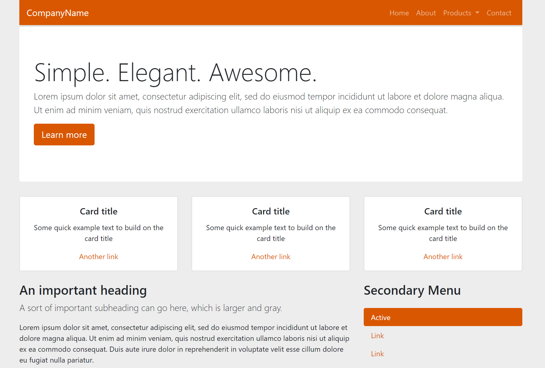
</div>The result in the browser should look like this:
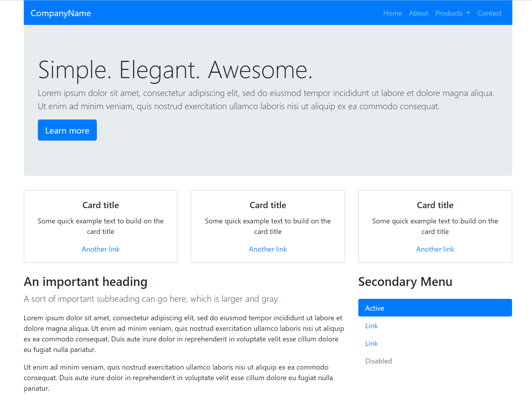
You can also check it out on smaller viewports and notice that it's perfectly responsive. There are, of course, a lot more options associated with navigations.
We now have a pretty standard layout that you might find on most websites. The problem is, it's very cookie-cutter.
Fortunately, Bootstrap 4 has a robust system that enables customizing common elements quite easy.
Open up the /src/scss/styles.scss and paste the following:
// Variable Overrides

// Bootstrap Sass Imports
@import "node_modules/bootstrap/scss/bootstrap";
According to the Theming section, you can choose to either include all of the Bootstrap 4 sass files, or you could include individual items based on your needs. To keep things simple, we'll just import everything as we have above.
Perhaps the most common theming need is to change the colors.
If you open up the node_modules/bootstrap/scss/_variables.scss file, you will notice at the top it mentions Color system. In this section, you will see all of the variables that you're able to overwrite that to pertain to colors.
Let's change just the primary color, modify the styles.scss to the following:
// Variable Overrides
$theme-colors: (
  "primary": #d95700
);
Save it, and this is the result:
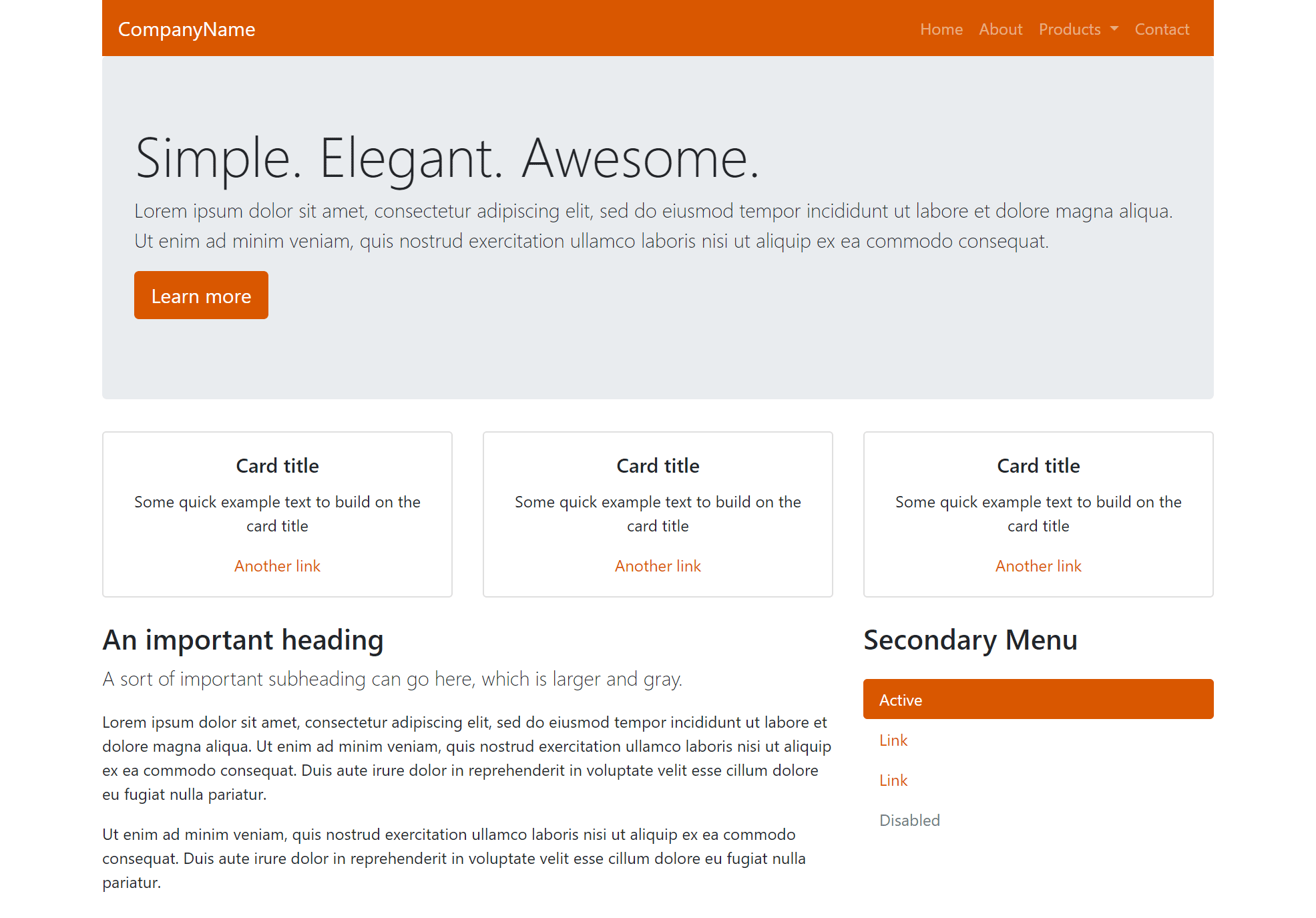
Dead simple!
Let's also change the background color:
// Variable Overrides
$theme-colors: (
  "primary": #d95700
);

$body-bg: #ededed;
Now the result looks like this:
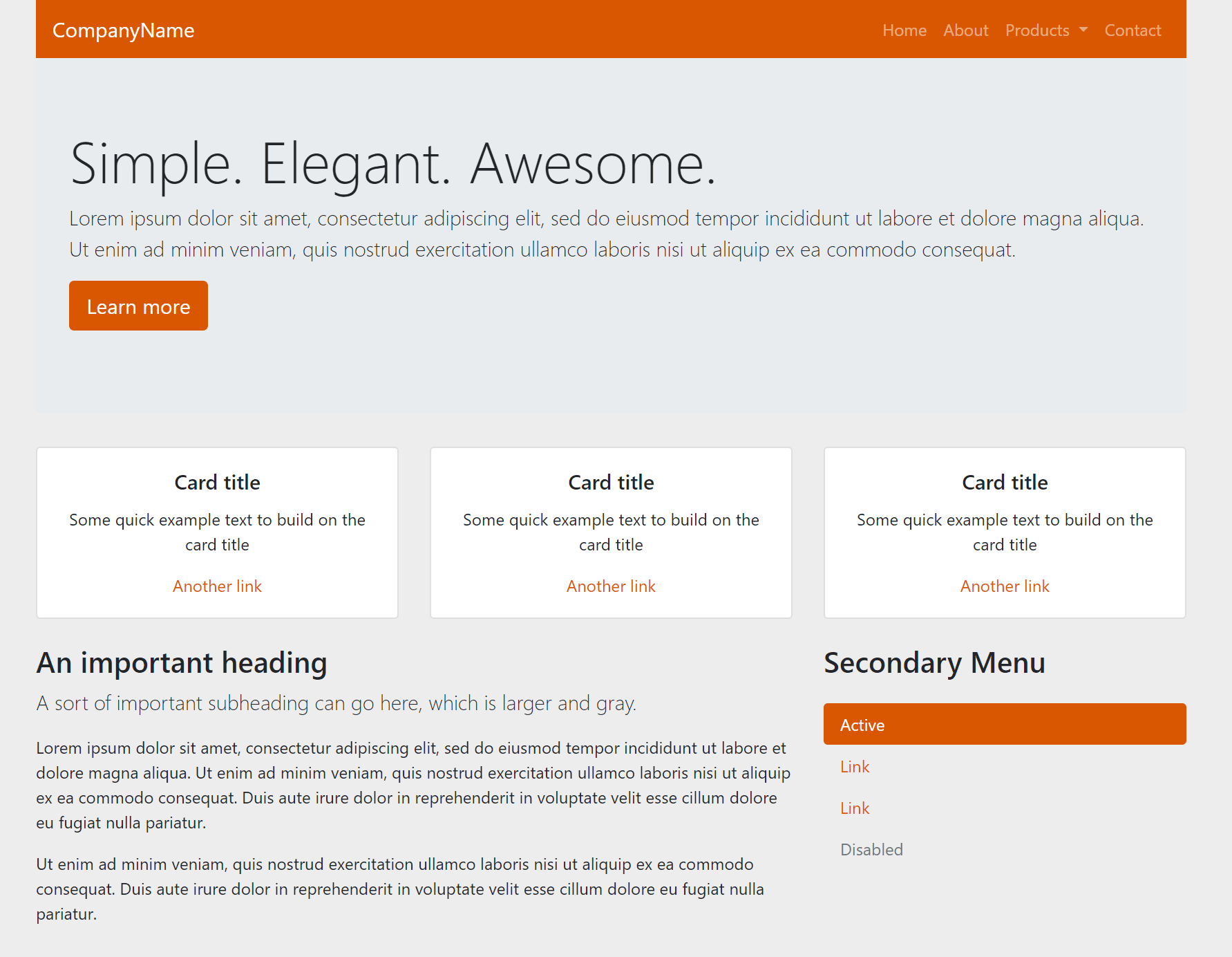
Hmm, now, our jumbletron (hero) section looks ugly, as it was also gray.
We can make custom adjustments to specific elements by using the inspector in chrome or firefox, finding the associated classes of the elements we want to change, and changing those in our styles.scss file.
In this case, the class responsible for the jumbotron is .jumbotron. Let's change the background color and add a slight border to the top of it, to simulate a dropshadow from the navbar:
// Variable Overrides
$theme-colors: (
  "primary": #d95700
);

$body-bg: #ededed;

.jumbotron {
    background-color: #ffffff !important;
    border-top: 3px solid rgb(219, 219, 219);
}
Now, the result:
Awesome!
Hopefully you enjoyed this crash course / tutorial on Bootstrap 4. We only scratched the absolute core fundamentals, and there's plenty more you can learn. At this point, anything else you need to learn should be simple, as now you understand the basics and that almost everything is covered in the documentation.
Good luck!

